This character need no introduction (well, maybe just a little), he was the star of the show in the Micheal Bay incarnations of Transformers and the trend spreads to Transformers Animated and Transformers Prime (up to the Finale, WTF?)
 |
| Pic Credit : Web |
Bumblebee is a character that strive, that pretty much sums it up. He was since the beginning, one of the characters that received more G1 toy treatment than any other characters. But, Hasbro lost their favorite player right about the time Beast Wars and Beast Machines aired. Apparently, BEAST Wars and BEAST Machines era weren't really kind to him, BumbleBEE
Packaging
To be honest, I'm really digging the artwork and presentation, have an 'Exclusive' feels to it
The artwork featured is really good, personally. It kind of give Bumblebee a 'mature' look
Instead of the usual way, Hasbro introduced a non-traditional way of packaging as the artwork featured is actually from a comic book that it came together with. And no, it's not your run of the mill free 'comic book' instead, a full-fledged, high quality comic books.
However, I won't go through the comic book, prefer leaving the surprised to each future-owner of him. Still, excited to see if the characters showed in the book will received figure treatment in the near future of not.
Alt Mode
Still maintaining the Movie-verse look, Bumblebee alt mode felt a bit too light and 'hollow'
Hasbro did a great job on the paint though, none-to-almost-zero paint smudge. Am not a huge fan of sticking big weapons to alt mode so I'll proceed without it
There you go, I think it looks better this way
Nice detailing, glad for it as I've seen worst.
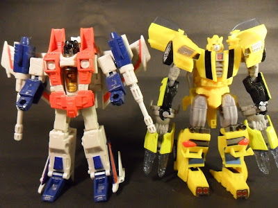
Size wise, he's a tad bit smaller than Classics Starscream, making him roughly the same, if not bigger, than most of Deluxe Car nowadays
Robot Mode
Honestly, never thought of seeing this design came to being as I love the way Bumblebee was in IDW's Ongoing
Up-close however, was a bit dissapointed as to see his paint apps is very minimal especially on his face.
Aesthetic wise, Hasbro did great in my opinion, in designing him. However, the small arms look too small and skinny
Now for the bad part. He's hollow as hell! The parts of him that you can see from the front mostly are the same parts you'll see from the back.I used to bought few KOs here and there which frankly, this is how it felt like
Articulations wise, he's pretty average which kind of bumps me out. I thought that with the sacrifice they made to his mass, they could at least make of for it in his articulations.
His head is only on a swivel joint, limited waist swivel due to not enough clearance (see previous picture), knees and elbows bend to more-or less 45o and the worst part, the shoulders are very limited. Imagine Generations Drift but without the hands straight to the front
There are many ways his weapon can be used, either a blaster as previous picture or sword-like as above.
 |
| Weapons as in the instruction |
He's roughly the same height as Universe Starscrea which at that time, considered to be small.
I was really excited when I got my hands on this Deluxe Wave however, Bumblebee dissapointed me. And no, I never hated him, not in TFTM, not in ROTF, not in DOTM, certainly not in TF:Prime (1st edition rock!)
But this incarnation of Bumblebee, to be perfectly honest, was poorly executed
Moving on....


No comments:
Post a Comment